How to fix CLS: images, fonts, and dynamic content
To fix Cumulative Layout Shift (CLS), find what changes an element’s position after it first appears, then make that space predictable. Common causes include late content, images without dimensions, and fonts that change text wrapping. Compressing an image alone will not reserve its space.
Start with the page where the movement happens. In this guide, a small demonstration store makes the cause visible: a delivery notice arrives above the products. We keep the content and timing the same, then change only whether its space is reserved.
What CLS tells you
CLS measures unexpected visual movement. It has no time unit: it reflects how much visible content moves and how far. Google’s good threshold is 0.1 or less at the 75th percentile of page visits. One local reading cannot establish that a whole site passes Core Web Vitals.
The current metric uses the largest session window of unexpected shifts, rather than adding every shift throughout an unlimited visit. Recent user input can also affect whether a shift counts. Google explains these rules in the CLS definition.
A loading audit is useful, but visitors can encounter movement later: when they scroll to an embed, open a different route, or receive personalized content. A low initial Lighthouse CLS does not prove every later state is stable.
A delivery notice that pushes the catalog
FIELD / GOODS is an intentionally simplified demonstration store, not a customer website. A notice is inserted 1,500 ms after the document becomes ready. The first version has an empty slot with no reserved height. When the notice arrives, the product heading and cards move down.
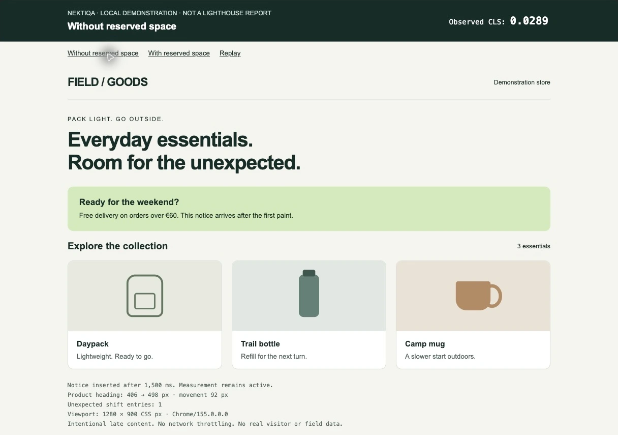
Local Chrome capture, October 22, 2026. At 1280 × 900 CSS pixels, the heading moves from 406 to 498 pixels. The page’s Layout Instability API observer reports CLS 0.0289.
The second version reserves the notice’s height before its text arrives. The products start in their final position. Both screenshots show the same final content; the difference is what happened while it appeared.
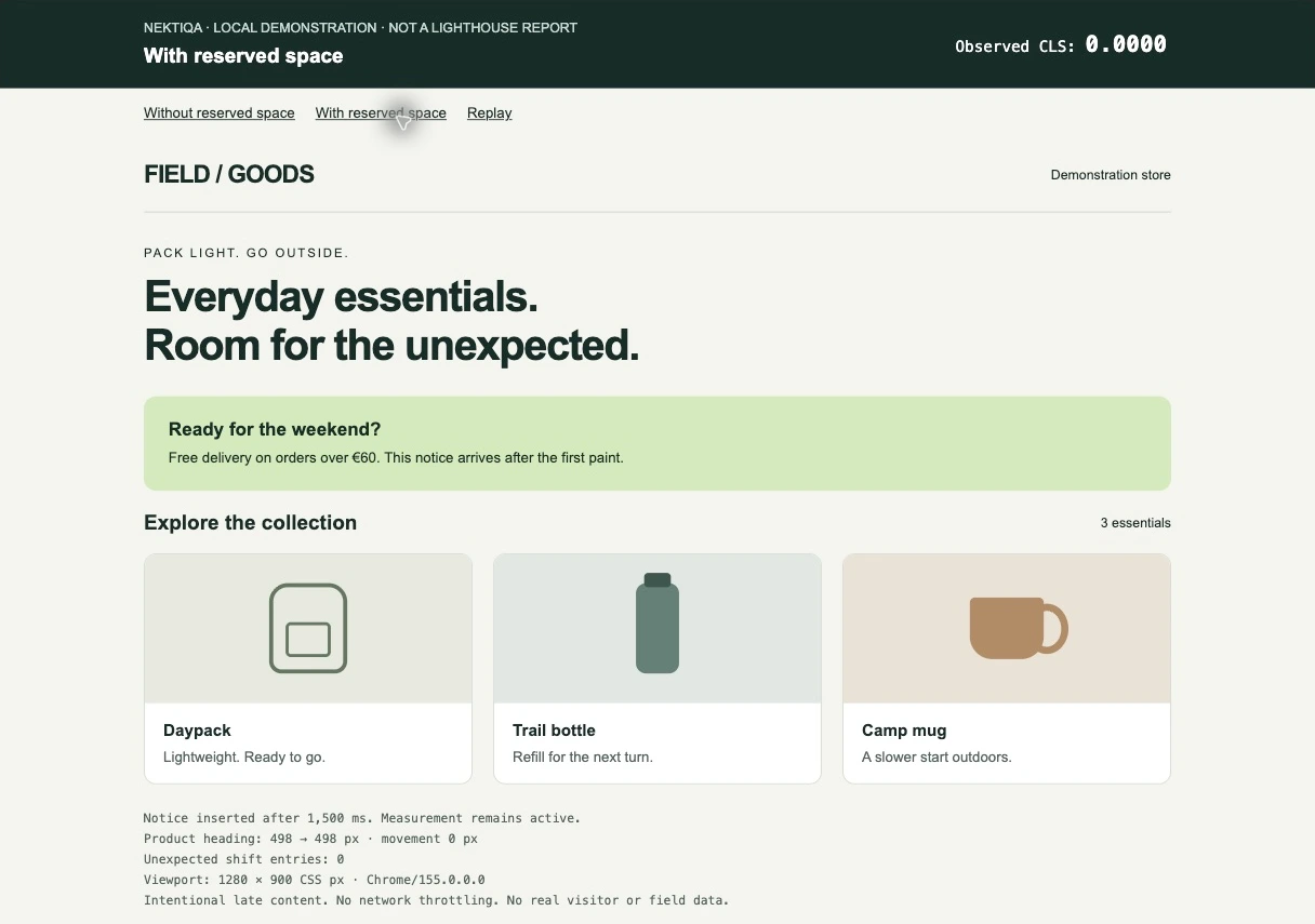
Same browser, viewport, content, and delay. The heading stays at 498 pixels; observed CLS is 0.0000 for this demonstration.
| Viewport | Without reserved space | With reserved space | Heading movement |
|---|---|---|---|
| 1280 × 900 | 0.0289 | 0.0000 | 92 px → 0 px |
| 390 × 844 | 0.0451 | 0.0000 | 116 px → 0 px |
These are individual local observations in Chrome 155, without network throttling, collected on October 22, 2026. They are not Lighthouse reports, field percentiles, or a forecast for another website. Even the moving version stays below 0.1 in this small experiment: a visible jump and a page’s overall classification are different questions.
Open the unreserved demonstration, then compare the reserved version. Keep the viewport unchanged, reload, and wait for the notice without scrolling or interacting. The observer excludes shifts following recent input and keeps the largest session window. Results can change with viewport and browser behavior.
Find the cause, not just the element that moves
Open Chrome DevTools → Performance and record a reload. Reproduce the actual problem: wait for the notice, scroll toward the video, or navigate to the affected view. Inspect the layout-shift entries and the surrounding screenshots. The Performance panel documentation describes recording and inspecting traces.
The highlighted product card may be a victim of movement. Look above it: did a notice arrive, an image gain height, or a heading wrap onto another line? Fixing the card’s margin would hide the symptom only for that particular state.
Repeat with a narrow viewport and a cold load. Record the cookie-banner state, signed-in state, and route. If a consent tool is involved, reproduce its normal behavior rather than disabling it only for the test.
Make space predictable
Reserve the late block’s space
For the demonstration, the only layout change is a minimum height on the existing slot:
.notice-slot {
  min-height: 92px;
}

@media (max-width: 600px) {
  .notice-slot {
    min-height: 116px;
  }
}
Those values belong to this example. Measure your content at its real widths and languages: translated text and larger text settings may require more room. A skeleton should match the eventual block’s geometry. Removing a reserved slot later can itself move the page, so check that state too.
Give images an aspect ratio before they load
Declare the source’s intrinsic dimensions and let CSS scale the image proportionally:
<img
  src="/images/daypack.webp"
  alt="Green daypack with a front pocket"
  width="800"
  height="600"
  style="width: 100%; height: auto;"
/>
In Next.js, supply appropriate dimensions to Image, or give a fill image a parent with a defined size or aspect ratio. Keep responsive sizes accurate for image delivery. These solve related but distinct tasks: reserving geometry and choosing the download. See the Image reference.
Check the font swap
Watch the heading while the web font loads. If the fallback fits on two lines and the final font needs three, everything below can move. Match fallback metrics and check the actual family, weights, and language subsets. font-display: swap allows text to appear earlier; it does not guarantee stable wrapping.
For Next.js, next/font provides self-hosting and fallback adjustment options. Verify the result with an uncached font request and your real text, especially across languages.
Keep initial content available in the initial render
A catalog that starts empty and fills from a client effect can change the whole page’s height. If the data is already available on the server, render the initial products there and pass that same initial state to the interactive component. If it must arrive later, reserve a realistic loading layout.
A Client Component does not automatically mean “no server-rendered HTML.” Next.js can prerender Client Components for the initial page load. Investigate when the data becomes available and whether the initial markup includes it. The Server and Client Components guide explains that boundary.
Verify the page visitors actually receive
Repeat the same scenario before and after the change. Keep the URL, viewport, browser, and content state consistent. Inspect the trace alongside the number: confirm that the intended block stopped pushing other content and that the notice, images, and controls still work.
Check the first load and the later interactions that caused movement. Then review available field data separately; it represents real visits over a collection period and will not instantly become a new local result after a deploy.
Use a free NEKTIQA speed test for Lighthouse diagnostics and performance history to follow comparable lab runs after later changes. For a result that differs from another tool, read PageSpeed Insights vs Lighthouse. For image delivery and embedded widgets, continue with three practical website performance fixes.